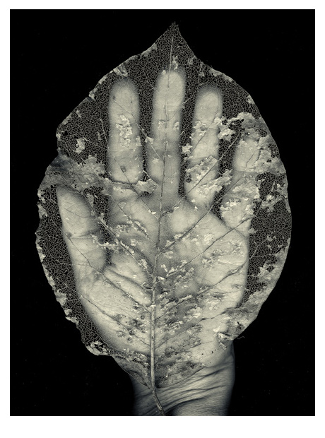
Hand with Magnolia Leaf
Hand with Magnolia Leaf
archival inkjet print
20.3 x 15.25 cm. (8″ x 6″)
I have forgotten to post this image of a print edition I did some time ago. Some readers may recognize this as a smaller black and white variant of this larger full colour one.
If you are new to my work, you may see more of the Hands series at the Hands link on the left side under Printworks, or visit the Gallery (still a work in progress that has stalled while awaiting a new site in WordPress).
July 8, 2014 in Digital printmaking, Hands, Printworks by Marja-Leena

More drawn to the black/white image of the two photos, I began to wonder whether this preference is generationally determined. Born into the 1930s world of black and white movies, have always noted that color distracts from seriousness of message. But photography? I’m not sure.
Naomi, that is an interesting observation and you are probably right. There are many who prefer black and white photos and they do have something of a revival these days. Perhaps b & w is ‘new’ again. I like both. I also come from a background of printmaking where etchings used to be done in rich black ink. Whether colour is a distraction may depend on the image – or just a personal preference as it is for you – and that is okay.
I remember liking the fact that the leaf had turned golden in the colored scan. I like this version as well – the combination of hand and leaf seems emblematic of the transience of life.
Susan, I’m pleased you like both versions. I think another difference, which is not so obvious here online, is the size of the prints. This is a fairly small intimate print compared to the large colour one.
I am lucky enough to have two screens on which to compare the two images. It is so interesting how different the two are, added to of course with the reversal of the image. I am intrigued that the b/w version looks flatter – perhaps something to do with the tonal range. I really like the idea of the b/w one being intimate. I like them both, but at the same size I prefer the colour one – there is something ‘shining’ about it which seems optimistic. The b/w one seems sadder to me, a kind of mourning. Fascinating.
Olga, thanks for your very thoughtful observations, and I agree that the b/w one is more somber. I think the image does not show well on the screen… perhaps I should have brightened it but did not feel it honest to adjust the actual print file. It is a fascinating comparison.
I like both pictures equally well. But if there would be a series, would you choose for an exhibition both colored and black and white? Or maybe put colored on another wall than the b & w photos? Or would the content decide the place in the exhibition?
I’ve been watching my husband’s turn from being a painter into being a drawer. Most interesting is that he’s starting to have now some color in drawings. First appalling, then intriguing. Of course it’s useless to ask what does he means. He doesn’t mean, the pictures have meanings but they would be different for all individuals who see them.
It’s very true, that if one has learned to watch black and white movies, it ends up being a true color mode, as the brain turns images into colors. I haven’t flowed enough of brain research to know if that is true, but it could be. I remember explaining some movie from my childhood to a friend by saying that the landscape was beautiful and lakes were very blue. And I remember the baffled expression on my friend’s face.
I backed up: no, I mean that the camera man was so very good that I saw almost the blue.
Ripsa, to answer the first questions about exhibiting, I think it depends a lot on the whole concept, space and so on. I have thought about having small ones along with the large ones that I’ve completed, and those small one might be b/w and or colour, and grouped grouped separately if both, I think. This is the only one so far that made it into prints. I’ve posted quite a few ‘hands’ photos that are not in print yet, and have also discussed this idea here.
Oh yes, don’t ask me what my work means!! But I love to hear what viewers think they mean 🙂
Very interesting what you say about seeing colour even in b/w film – our brains are conditioned to know that the lake is blue.
Oh, yes. Now I don’t know which of the versions I like best. One of my favorites…
Marly, I still love most the big one that I printed as part of the Hands series, as well as this small print. I’m just playing with other possibilties that might work with my home printer while still thinking about more Hands.