Finnish ABCs 2

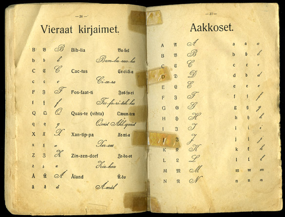
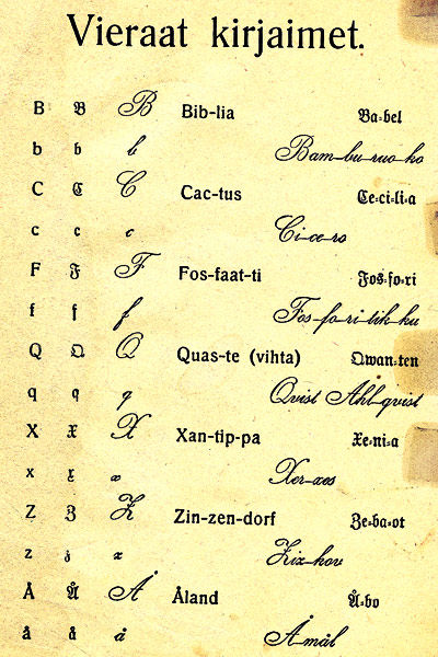
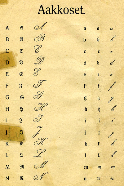
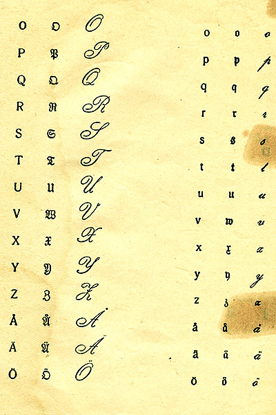
As mentioned earlier about this old Finnish primer, I became most fascinated by the variety of fonts shown side by side. Imagine a young child just learning the ABCs and beginning to read, also learning to read along with what I would call a regular print text, a German Gothic or fraktur font and a copperplate style script. I used to be able to read the Gothic in my childhood because the Finnish church in Winnipeg had very old hymn books with that font. Now I struggle with some of the letters, though the little tales in this reader really help with context. Hand writing styles surely aren’t that easy for new readers either.
I’ve zoomed in on a few pages of the alphabet itself below, so you can see how complex it all is. Vieraat kirjaimet translates as foreign letters, that is, those not part of the native Finnish alphabet. Aakkoset is alphabet.


(Apologies with the varied colours of each page as I struggled to make the letters appear clearer and sharper.)
I just had to go find my own Finnish Aapinen, printed in 1954, to check out its fonts. The first part of the book has all capital letters, then soon after the small case are introduced along with it. Though there are a few other fonts later in the book, they are all fairly standard and easy to read. One page near the end shows a handwriting exercise on ruled paper like we see even today. Gothic and copperplate were not to be found.
April 24, 2012 in Books, Finland, Estonia & Finno-Ugric, Found Objects, History, Home, Photoworks by Marja-Leena
Nämä ovat kauniita vain ikänsä.
These are beautiful simply because of their age. I tried that sentence in the Google Translator and wonder how well it works.
I’ve probably told you that my parents used to say that when they were young the English dialect changed with every five miles in the countryside. I wonder how long it would take for major changes in modern languages if communities became isolated again.
Susan, I was startled to see the Finnish words! A pretty good translation except perhaps add ‘suhteen’ to the end, to cover “because of”.
No, I don’t recall that story but I believe it, even in the Finnish countryside, though maybe less so these days. Good point, isolation (including no media) would surely slow down change to languages.
I have been enjoying these Finnish language related posts. What interesting words chosen to show the letters, like Xantippa! I remember an old copperplate copy-book around when I was a child, and my uncle saying when he learned German all the texts were in Gothic.
Lucy, I’m so pleased you are enjoying this sudden glut of Finnish language posts. I had not planned it that way, forgetting that lecture was on in the middle of my alphabet ones. Those foreign words are quite unusual, aren’t they? And yes, I think a lot of educational and religious German texts were Gothic until about the mid 1900s, even those in other north European countries.
I’m remembering that Tolkien almost failed his exams because he discovered Finnish and fell in love… I think he talks about it as a wine cellar of intoxicating substances–something like that. And so Quenya was born from Finnish, out of love.
Very interesting to see these.
Truly amazing. The little x was new to me.
rouchswalwe, you would know the Gothic lettering, I think? They are all so exquisite and decorative looking, like on some illuminated manuscripts. Makes me almost want to learn how to write it.
Marly, I was quite astounded when I learned about Tolkien’s love of Finnish and his creation of the Quenya language in my early days of blogging, when I learned about the connection between the Lord of the Rings and the Kalevala. However I didn’t know he almost failed his exams, and thought Finnish that intoxicating! Thanks for telling me.