more driftwood
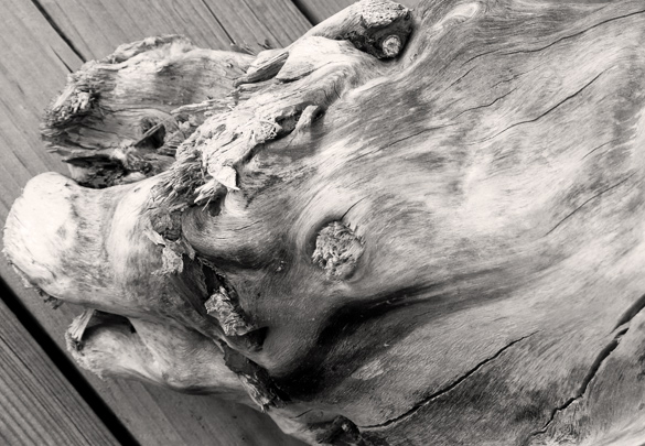
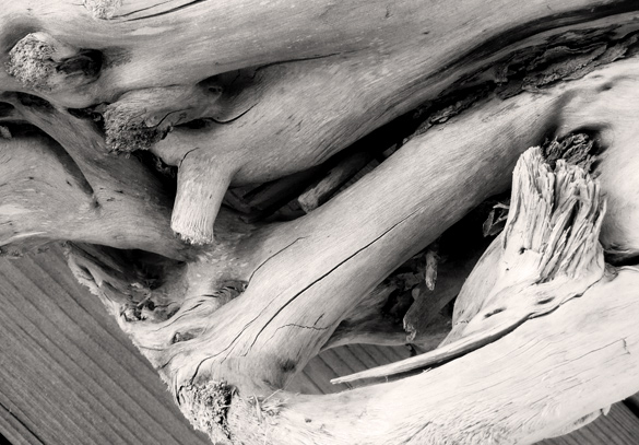
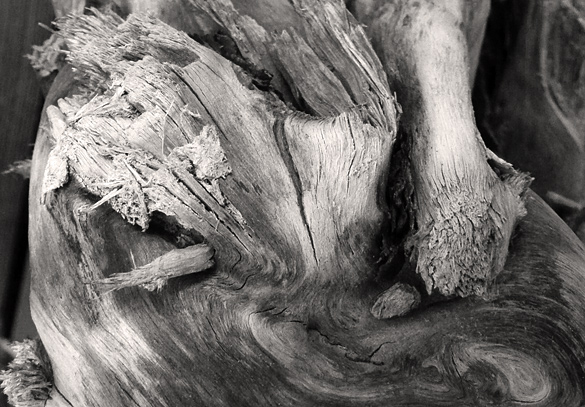
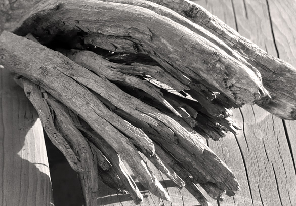
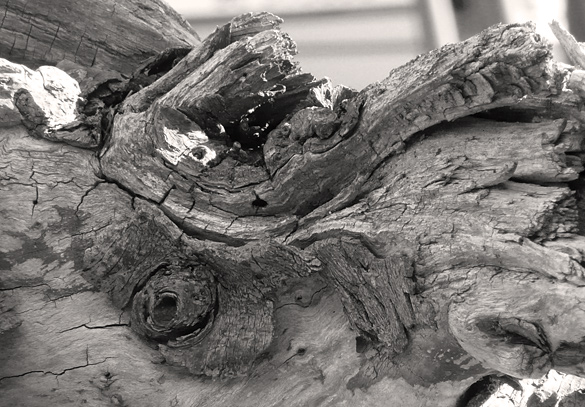
In this series of driftwood on Lillooet Lake which I’ve been posting, many of the photos appeared somewhat blue in hue. With this group, I played with desaturation, which gave me black and white, then added a light sepia filter. To me, this seems truer to the tones of the bleached and beached wood. Or maybe these just look more “artistic”?
September 8, 2013 in Being an Artist, Photoworks, Textures by Marja-Leena
Now obviously driftwood is organic, but the shapes within shapes remind me of areas within the fleshly body, as well as distorted layers of sedimentary rock. Another fine feast of sylvan delights.
Roots, burls and twisted sweeping lines do make them appear like animals. The textures are very interesting indeed but this group looks more black and white to me than the last you posted.
Tom, thanks again for your always generous responses to my work!
Susan, yes, I thought some of these do look rather animal-like, especially the first one. The ones in the previous post had the colour saturation pumped up a bit, while these ones are desaturated to B&W with a touch of sepia added after. Interesting, that sepia perhaps doesn’t show up on some screens – maybe I should have made it stronger.
Hey that’s a dog in the first photo rooting out something interesting.
Joe, you see a dog, I see a pig, heh. What is that word for seeing creatures in inanimate objects?
Hah! I saw the pig too.
I seem to have failed to get my comment through again. Here I go again:
I can’t remember exactly what I said, but it was along the lines that I find driftwood, rather like sculpture, difficult to photograph because its three dimensionality is so important to its appeal – therefore quite a challenge to render in two dimensions. So I can see why your focus on the colour is important for you. I find that I am intrigued by the contrasts and the shadings of shapes, and therefore for me, strangely enough, they work best the more they are abstracted from three dimensions.
Susan, we “see” alike!
Olga, first, I’m sorry for the commenting problems, which I’m also having trouble with at times. I don’t know why.
Yes, I agree three-dimensional objects can be hard to photograph. The angle of the light seems important. These were taken in the lower light of late afternoon, early evening so there are lots of shadows and bright areas – sometimes even too much contrast. That is why I’ve been playing with levels, less colour, more colour and so on. Cropping close to eliminate some of the busy-ness seems to help with some of these, as more abstract images as you say. I wonder how these might work as prints.
Color is tricky. I think both sets were strong. As you say, the altered ones were more “artistic,” but the accidental effects in the previous set were interesting.
Hattie, thanks, I appreciate your input! Sometimes I think we try for too much perfection in an imperfect world, especially with all the temptations of digital manipulation now available.